Cerulean Design System, B2C Navigation Redesign, Blue Shield of California
As a Lead Product Designer on the Cerulean Design System, I led the B2C navigation redesign end-to-end from research to component adoption. This redesign took place in parallel with a member site information architecture redesign.
Project Purpose
Improve the website navigation so members can find the information they are looking for and increase the NPS (Net Promoter Score) score for "Find info on website".
How does this work support organizational goals?
Redesigning the B2C navigation will support the digital strategic vision of simplifying healthcare interactions by helping user's find the information they need to understand their plan.
Measurable Impact
NPS digital web driver YoY performance (Q1 2025 - Q1 2024)
- +2.7 pts (+24%) for "Find info on website"
"Website is easier to navigate than your competitors (Aetna). Support staff is responsive on the phone. A much smoother experience than prior years (with different companies)"
NPS: 9, Find info on web: 10, 0-6 months tenure
"Haven't had any issues getting a response from customer service. Very helpful. It's nice speaking to a person vs a chat bot. Website wonderful. Very simple."
NPS: 9, Find info on web: 10, 0-6 months tenure
"I value having a Blue Shield of California PPO becuase it allows me to see UCLA doctors for my ongoing care. I'm grateful for the coverage I have and thankful I can have this policy through Covered California. The Blue Shield of California website is easy to navigate."
NPS: 10, Find info on web: 9, 6+ years tenure
Team members
Diana Rios, Product Manager
M.K. Cook, Visual Designer
Grace Lau, Information Architect
Vikas Lnu, Angular Developer
Bibin Kattakayam Chandy, AEM Developer
Ajay Kumar Cherukupally, AEM Developer
Rajini Challa, QA Analyst
Holly Bun, Digital Content Author
M.K. Cook, Visual Designer
Grace Lau, Information Architect
Vikas Lnu, Angular Developer
Bibin Kattakayam Chandy, AEM Developer
Ajay Kumar Cherukupally, AEM Developer
Rajini Challa, QA Analyst
Holly Bun, Digital Content Author
UX Research
I conducted 100+ userzoom studies. Click tests asked users to complete top tasks on the navigation and surveys asked them about their preferences. In addition, I leveraged competitive research done by Grace Lau while redesigning the member IA, google analytics reports from the customer experience and analytics team and other advanced research conducted by our master usability specialist.
Key areas of research
- Search
- Log in/Register
- Portal links (links to the provider, broker, employer portals that are in the upper right corner)

Current member navigation
Search
What we do well:
- Search label
- Schematic icon (an illustration with less detail speeds up recognition)
- Positioned in upper right-hand corner
- Use a growing search box
- Don't isolate or crowd search
What needs improvement:
- Use plenty of contrast so the icon stands out from the background and surrounding elements
In researching search, we learned what users do 1st and 2nd to find information on a health insurance website
- 63% use the menu
- 51% use search
Layout
How might we improve the navigation layout to support these search preferences and best practices?
- Logo stays on the left because it supports brand recall.
- Search stays in the upper right-hand corner, where users look for it, with increased color contrast.
- Menu items move directly before search to support member preferences.
Current member navigation

Layout recommendation
"I like the search option on the right side. We read left to right. After reading the headings, if I don't see what I want, the search bar is next in my line of vision."
Participant survey response
Log in/Register
Why move "Log in/Register" and make it a text link?
- Creates more space in the main navigation area.
- Grouping the portal links with the "Log in/Register" makes sense contextually.
- The text link fits better in the utility navigation and does not affect users' ability to find the "Log in/Register" action.
Current member navigation
Layout recommendation
Portal Links
19% more participants were able to find the portal links by grouping them with "Log in/Register" and adding "For...".
Current member navigation
Layout recommendation
Layout Recommendations Overview
- Increase search visual contrast to align with search best practices.
- Move menu directly before search to support member search preferences.
- Group "Log in/Register" with portal links and add "For..." before portal links to improve visibility.
- Remove "Increase text size" to reduce clutter. This can be done in the browser.
- Move "Pay my premium" to the left side of the utility nav to maintain visual balance.
- Make navigation "sticky" on scroll so menu and search are readily available to users no matter where they are on the page.
Current member navigation
Layout recommendation
Visual Design
Points of focus
- Update visual style to match new brand, with a fresh and friendly aesthetic, making it unencumbered for users.
- Mimicking the button shape gives the navigation, the main point of wayfinding and initial engagement on the site, a clickable status.
- Accessible with a clear visual hierarchy.
Current member navigation
Layout recommendation

Cerulean application
Component Development & Adoption
I owned the UAT process and was the point of contact for both the Angular and AEM developers. Angular developed the component and then adopted it in the authenticated member experience and Find-a-doctor. The AEM developers built the component and were responsible for adopting it on the unauthenticated member experience and all member microsites.
What's next
- The cerulean B2C navigation component has been built in both Angular and AEM but still require iterative development to implement all elements of polish.
- Complete AEM navigation component adoption on all member microsites.
Member Page Examples
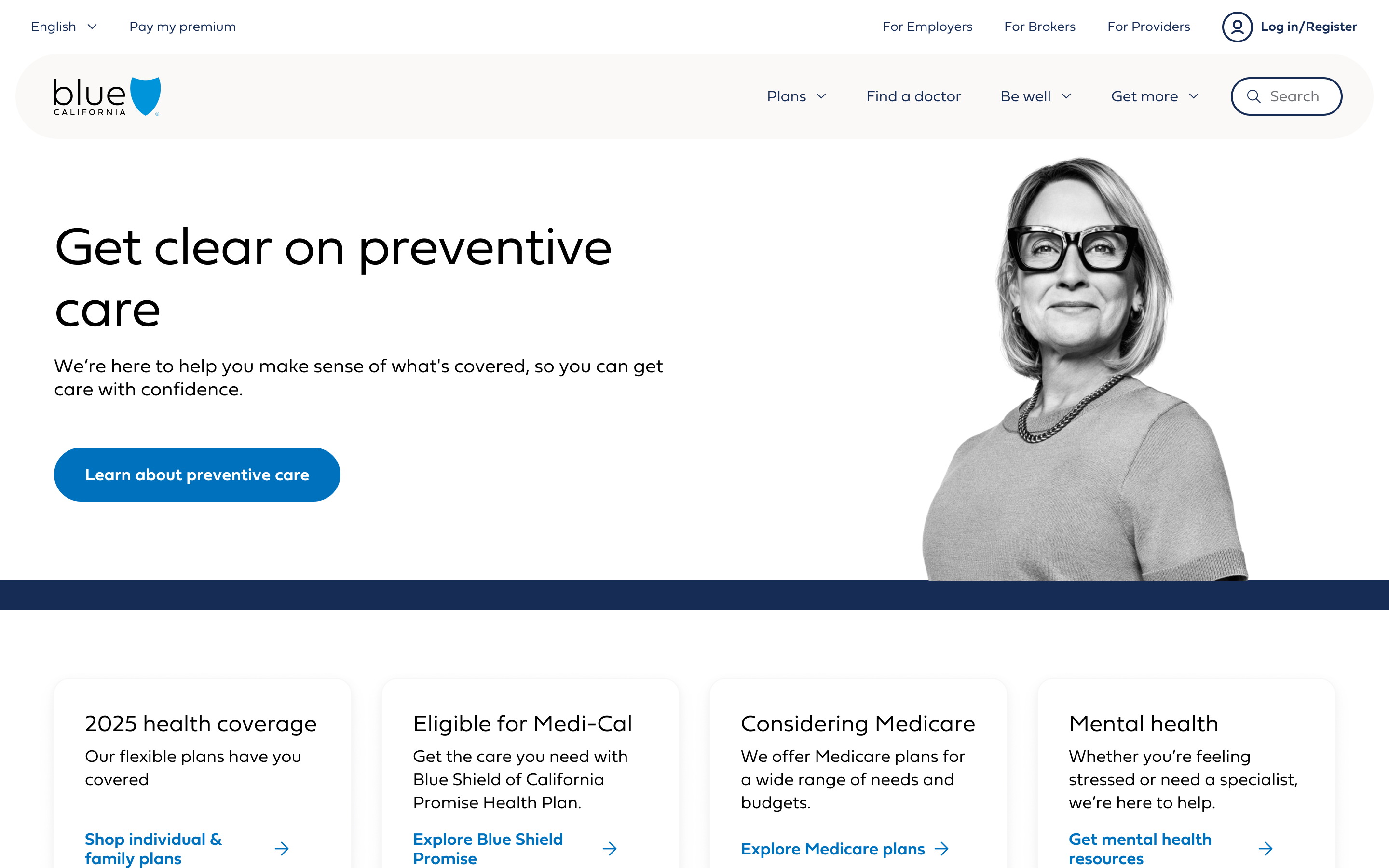
Member homepage
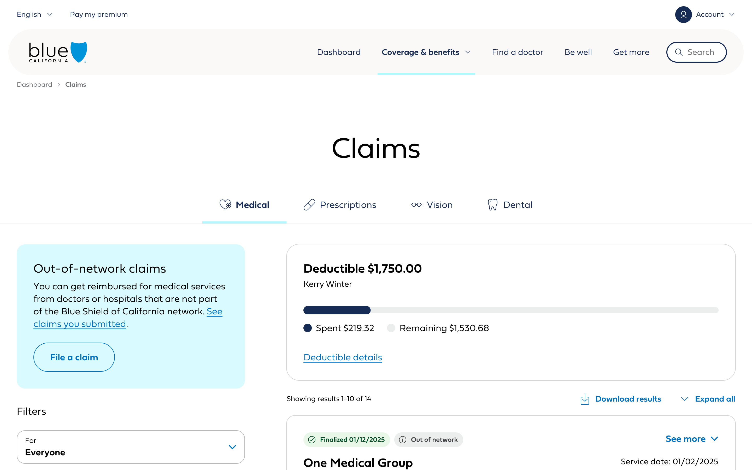
Member claims
B2C Navigation Variations
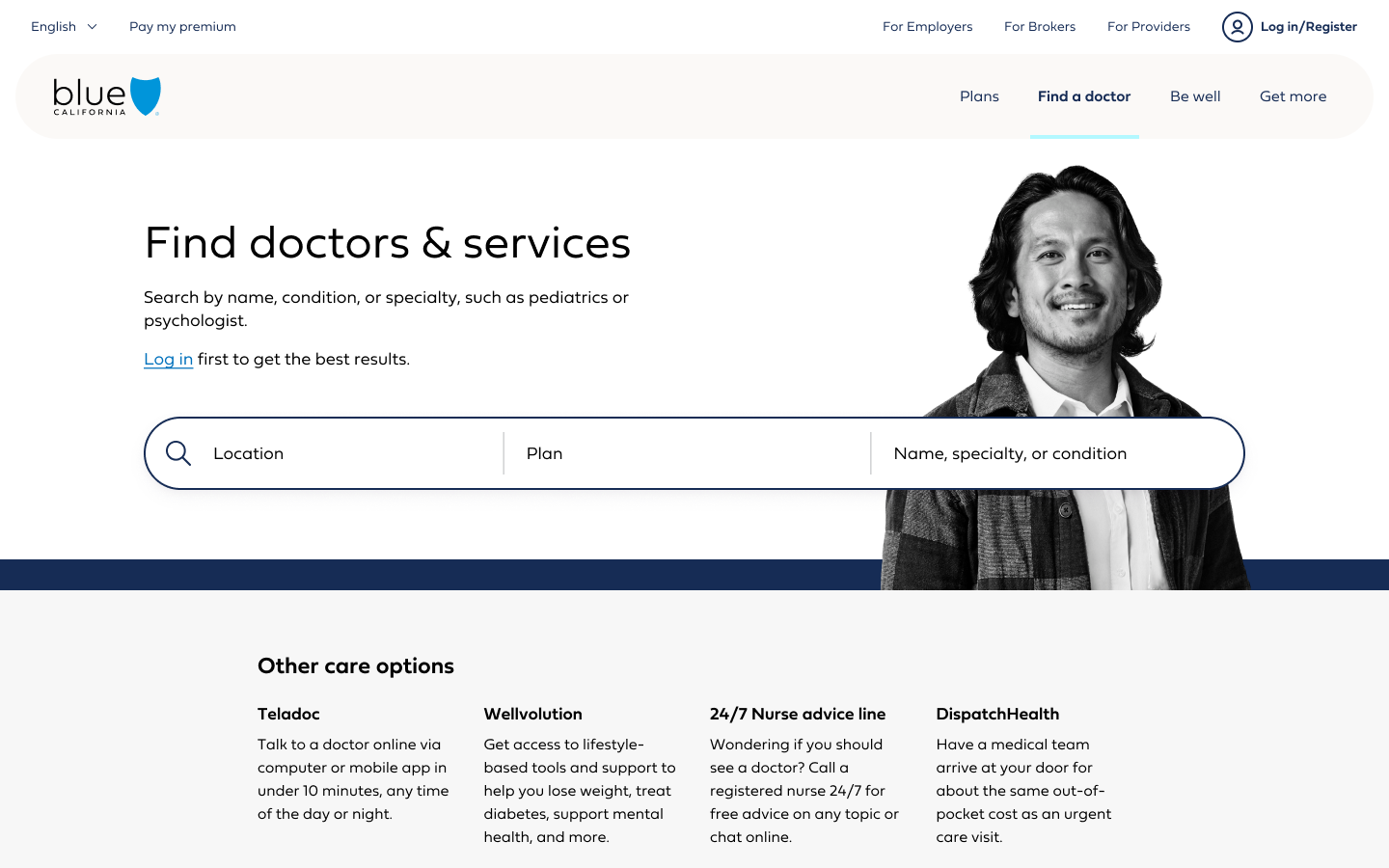
Find a doctor
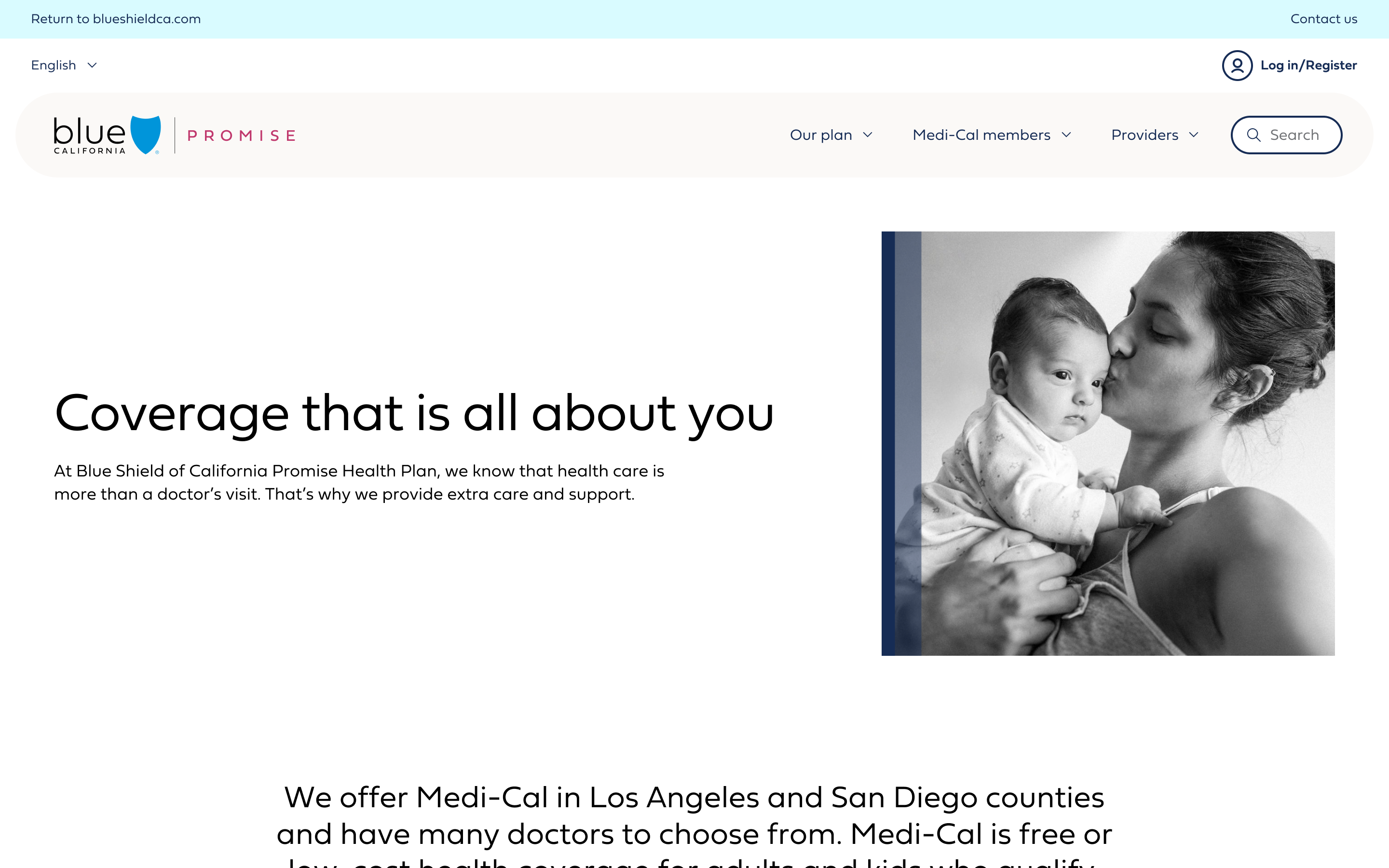
Promise (Medi-Cal)
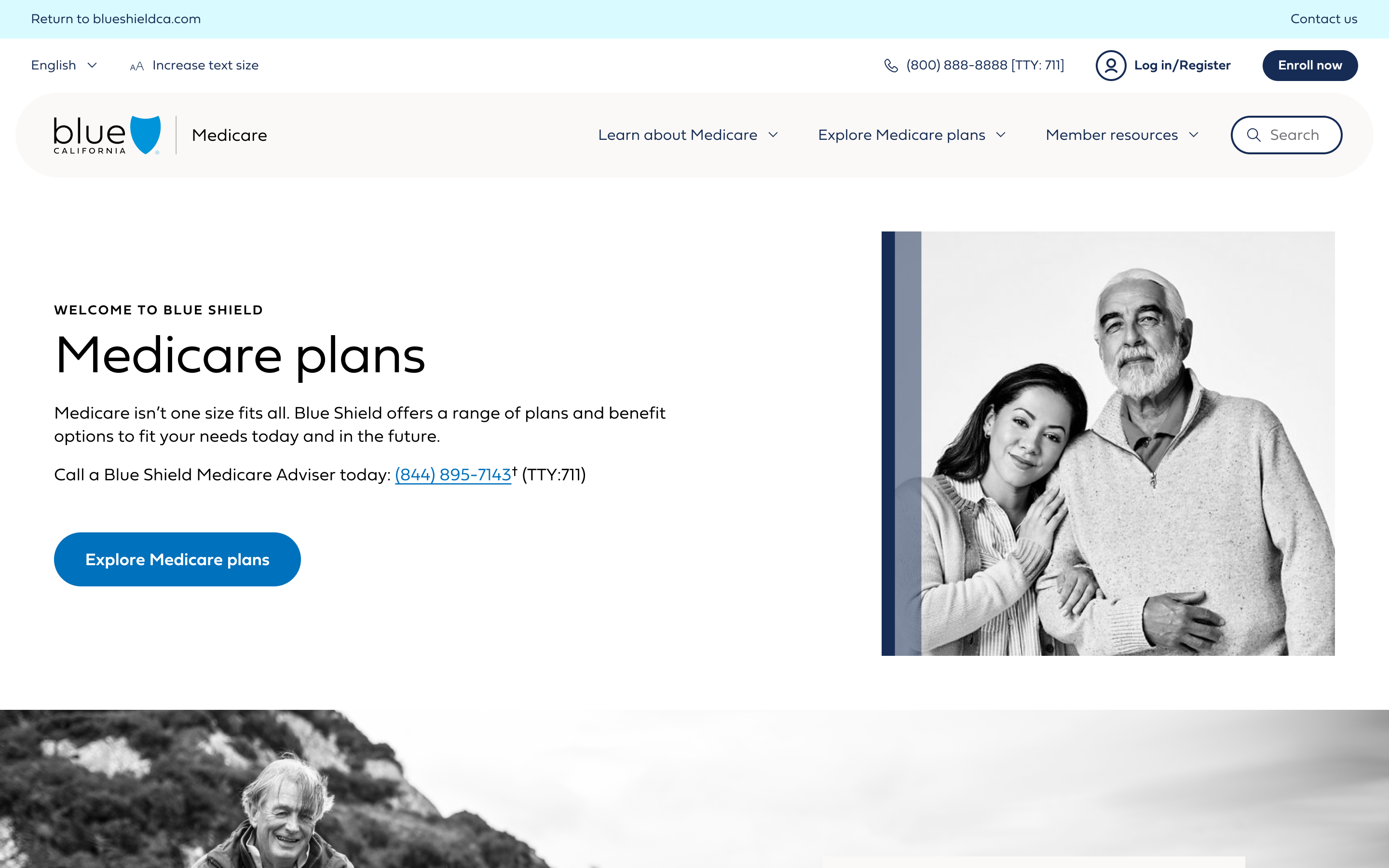
Medicare
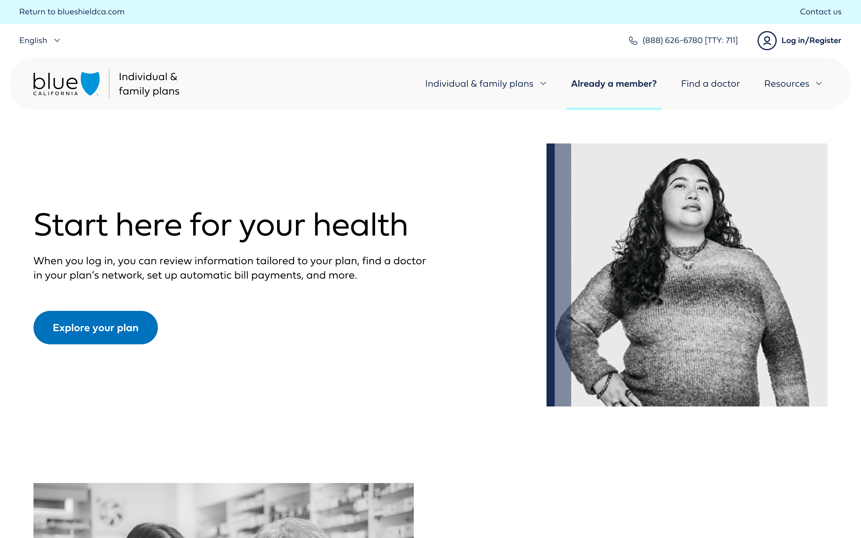
Individual & family plans